Plotting
Once all the data is parsed into the dataframe, seaborn provides a nice interface to allow simple plotting of different properties. Below is an example chosen almost at random.
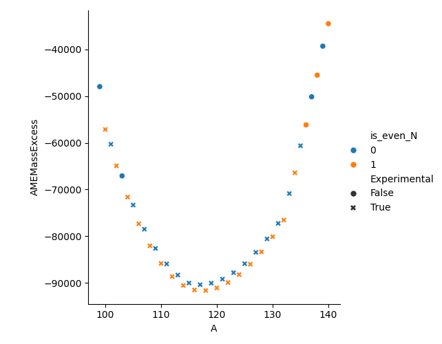
After populating the default mass table we slice on all Tin (Z=50) isotopes from the 2020 table and keep the ‘A’, ‘N’, ‘AMEMassExcess’ and ‘Experimental’ columns. We then create a new column flagging if the N value is even. We know Z is even as we selected only those rows with Z=50. With this newly filtered dataframe, we can plot how the AME Mass Excess varies for Sn across its isotopic chain using colour to highlight the even-even and even-odd isotopes and symbol to differentiate experimentally measured from theoretical values. As can be seen from the call to relplot, this is simply achieved by passing the column names we wish to use as the differentiator(s).
import seaborn as sns
import matplotlib.pyplot as plt

from nuclearmasses.mass_table import MassTable

table = MassTable().data

sliced_table = table[(table['Z'] == 50) & (table['TableYear'] == 2020)][['A', 'N', 'AMEMassExcess', 'Experimental']]
sliced_table['is_even_N'] = (sliced_table['N'] % 2 == 0).astype("Int64")

sns.relplot(data=sliced_table, x='A', y='AMEMassExcess', hue='is_even_N', style='Experimental')
plt.show()